
The Design Process
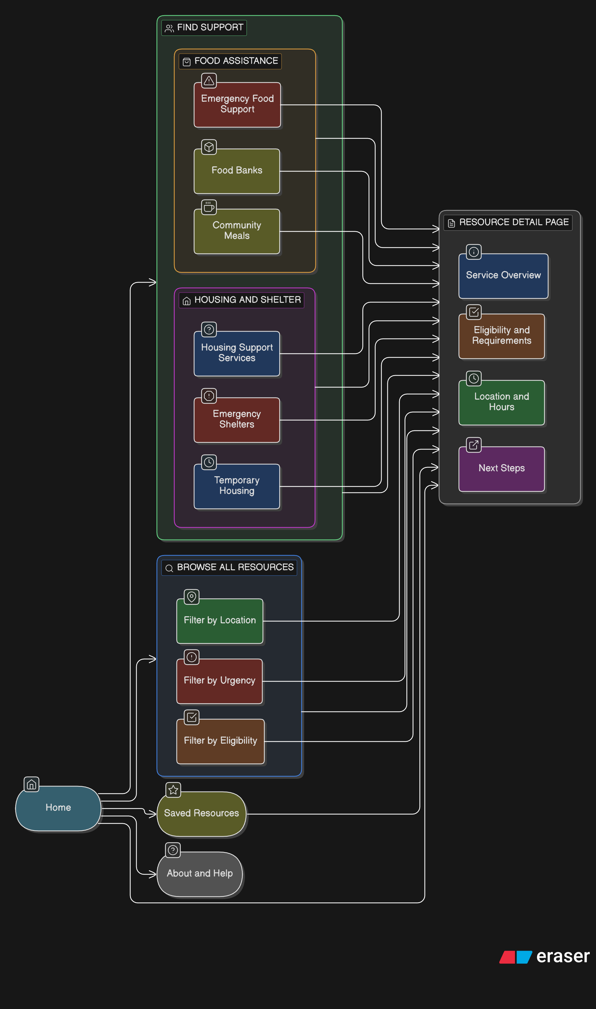
Information Architecture & Site Structure
The information architecture was designed to prioritize need-based discovery over organizational or municipal structures. Given that users may arrive in either an urgent or exploratory mindset, the structure emphasizes clarity, progressive disclosure, and flexibility—allowing users to move forward without committing to a single rigid path.
Rather than organizing content by service provider or city, the site groups resources by type of support, with location and eligibility treated as filtering attributes rather than primary navigation.
Key principles guiding the IA:
Reduce cognitive load at entry
Support both quick access and deeper exploration
Avoid requiring users to understand service systems upfront
Allow users to revise choices without restarting
High-Level Sitemap
Primary navigation focuses on “Find Support” to immediately orient users by need
Secondary navigation supports browsing and filtering without forcing commitment
Persistent location context (e.g., Metro Vancouver) reassures users that results are relevant
Search is available throughout, but not relied on as the primary discovery method
This structure supports both personas by allowing:
Alex (urgent) to move quickly from need → action
Maya (exploratory) to browse, compare, and plan
User Flows
The following flows represent the core paths users take when seeking food or housing support. These flows informed layout decisions, navigation placement, and interaction design.
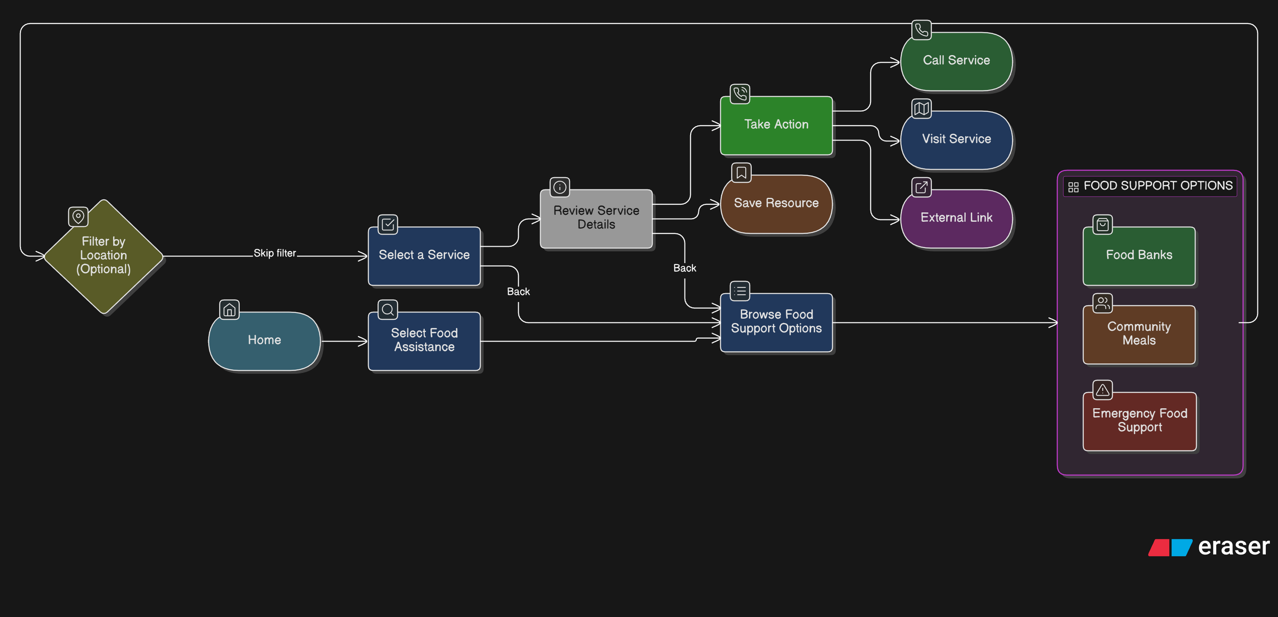
Primary Flow 1: Finding Food Assistance (Urgent or Repeat Need)
User Goal: Quickly find nearby food support and understand next steps.
Design Considerations
Food assistance is often time-sensitive and repeatable
Key details (hours, location, availability) are surfaced early
Clear CTAs reduce hesitation at the final step
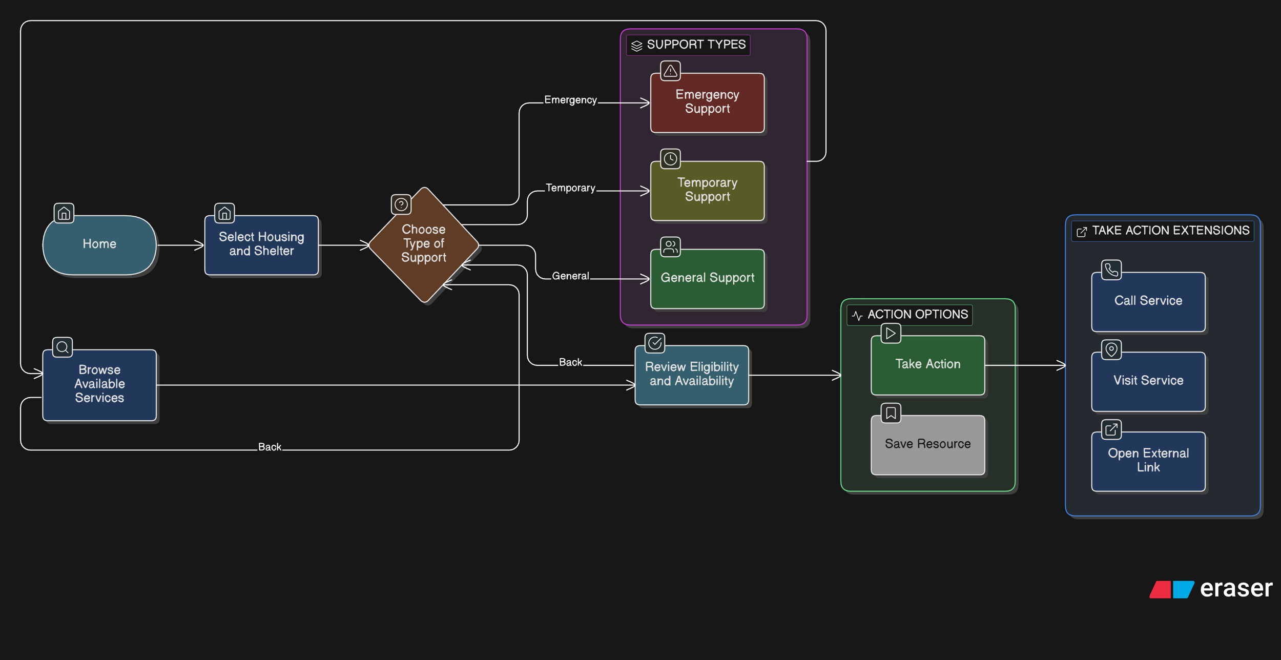
Primary Flow 2: Finding Housing or Shelter Support (High-Stress Scenario)
User Goal: Identify appropriate shelter or housing support without navigating complex systems.
Design Considerations
Language and tone remain calm and supportive
Eligibility information is clearly structured and scannable
Users can move backward or adjust filters without restarting
Interaction Design Rationale
Prioritizing Urgent Needs Through Clear Category Entry Points
Decision
The homepage presents two primary actions—Food Assistance and Housing & Shelter—as large, visually prominent entry points rather than a dense list of services.
Rationale
Users seeking essential resources may be under stress and unsure where to start. Asking them to first identify a high-level need reduces cognitive load and prevents early overwhelm. This approach mirrors how people mentally categorize urgent needs before considering specific services.
User Impact
Users can quickly orient themselves and begin the journey with confidence, reducing hesitation and abandonment at the first step.
Structuring Resources by Urgency Before Detail
Decision
Within Food Assistance and Housing & Shelter, services are grouped into clearly labeled subcategories such as Emergency Food, Food Banks, Emergency Shelters, and Temporary Housing.
Rationale
Different services imply different levels of urgency, availability, and eligibility. Explicitly labeling these distinctions helps users self-select the most appropriate path without requiring prior system knowledge.
User Impact
Users in urgent situations reach time-sensitive resources faster, while others can explore longer-term support options without confusion or false expectations.
Emphasizing Key Decision Information in Resource Lists
Decision
List views for emergency services surface location, hours, and eligibility requirements before users navigate to detailed pages.
Rationale
In urgent contexts, users need to quickly assess whether a service is even viable before investing time exploring it. Highlighting these attributes supports rapid triage and avoids unnecessary clicks.
User Impact
Users can eliminate unsuitable options early, saving time and reducing frustration—especially critical when resources have limited capacity.
Designing Resource Detail Pages Around Action, Not Just Information
Decision
Resource detail pages prioritize clear CTAs such as Contact Shelter, Visit Shelter, and External Site, with “Contact” emphasized as the primary action.
Rationale
Accessing support often requires human confirmation (availability, eligibility, next steps). Making contact the most prominent action aligns the interface with real-world service access patterns.
User Impact
Users are guided toward the most reliable next step, increasing the likelihood of successfully accessing support rather than passively consuming information.
Providing Reassurance Around Eligibility Uncertainty
Decision A reassurance line (“If you’re unsure whether you qualify, contacting the shelter directly is recommended”) is placed beneath the primary CTAs.
Rationale
Eligibility requirements can feel intimidating and exclusionary. Explicitly encouraging contact reframes uncertainty as acceptable and solvable, reducing anxiety and self-screening out.
User Impact
Users are more likely to take action instead of abandoning the flow due to uncertainty or fear of rejection.
Intentional Prototype Scope and Navigation Constraints
Decision
The prototype focuses on a single representative flow (homepage → category → emergency service list → first service detail), with back navigation available on all screens.
Rationale
The goal of the prototype was to validate information hierarchy, interaction patterns, and decision support—not to simulate every possible path. Limiting scope allowed deeper focus on clarity and usability of critical flows.
User Impact
Stakeholders and reviewers can clearly understand the intended experience without being distracted by incomplete or speculative features.
These interaction decisions directly informed the wireframes and high-fidelity screens used for prototyping and usability testing.
This project reflects my interest in designing thoughtful, human-centred experiences that make essential support easier to understand and access.
Questions about this project? Feel free to contact me :)