Project Overview

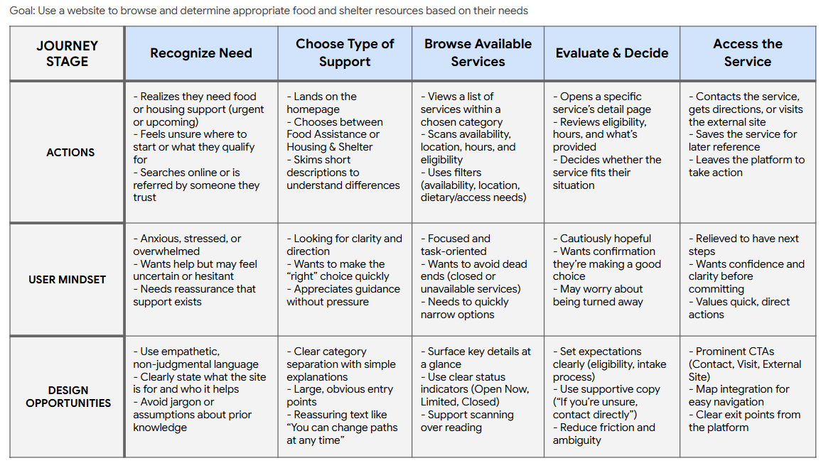
This project explores the design of a responsive community resource navigation website for Metro Vancouver, focused on helping residents find food assistance and housing/shelter resources more easily. The goal was to reduce cognitive overload and fragmentation by presenting support services through a clear, need-based structure that accommodates both urgent situations and exploratory planning.

The project is a conceptual redesign inspired by existing Metro Vancouver community resources, intended to address common usability challenges without replicating real systems in full detail.

Role: UX Designer (Solo Project)

Platform: Responsive Website

Timeline: 3 weeks

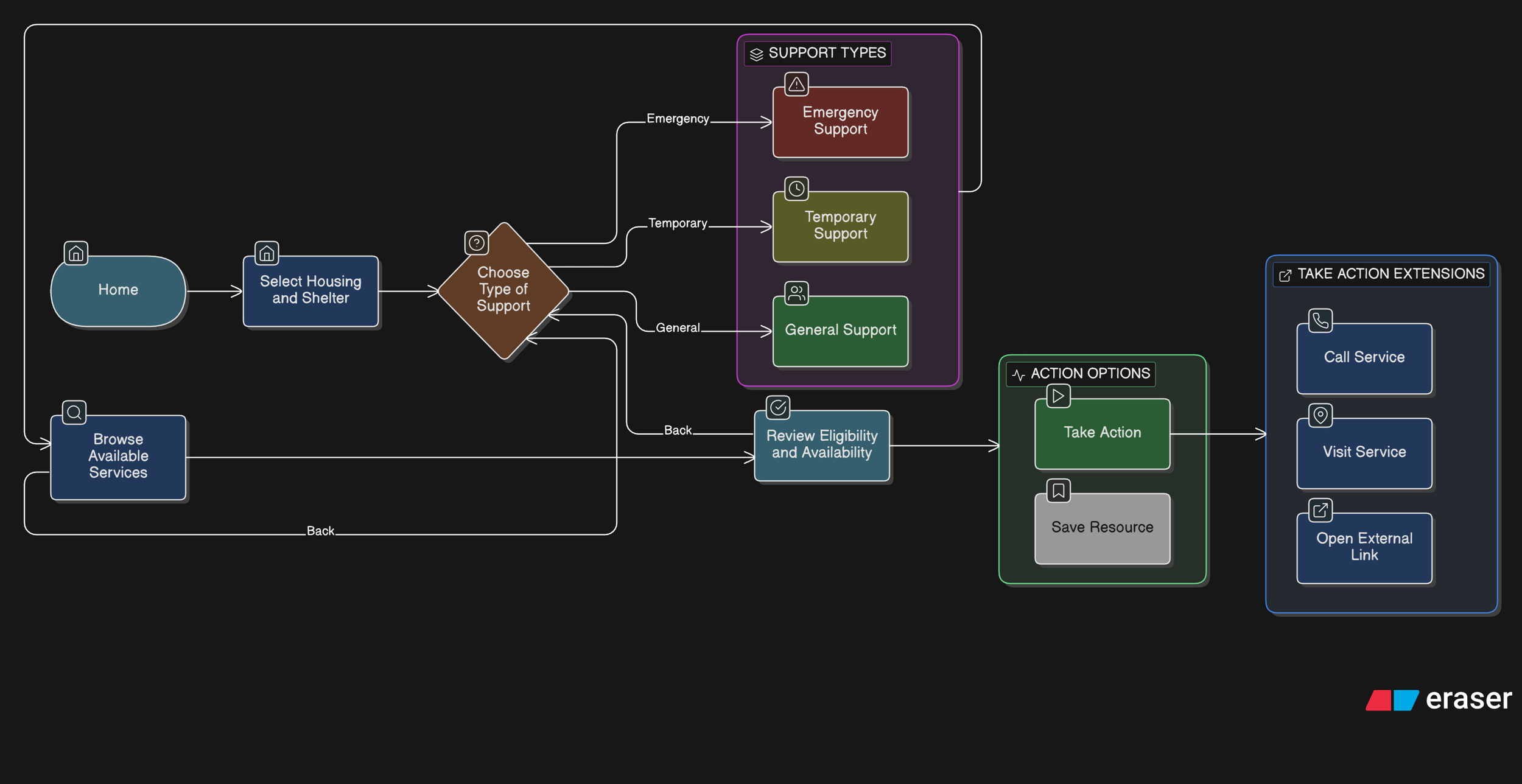
Scope: This project focused on designing a clear website experience for discovering food and housing resources in Metro Vancouver, prioritizing core flows from category selection to service details. Secondary features such as accounts, personalization, and real-time availability were intentionally deprioritized to maintain focus on clarity, trust, and decision-making.

View Figma File

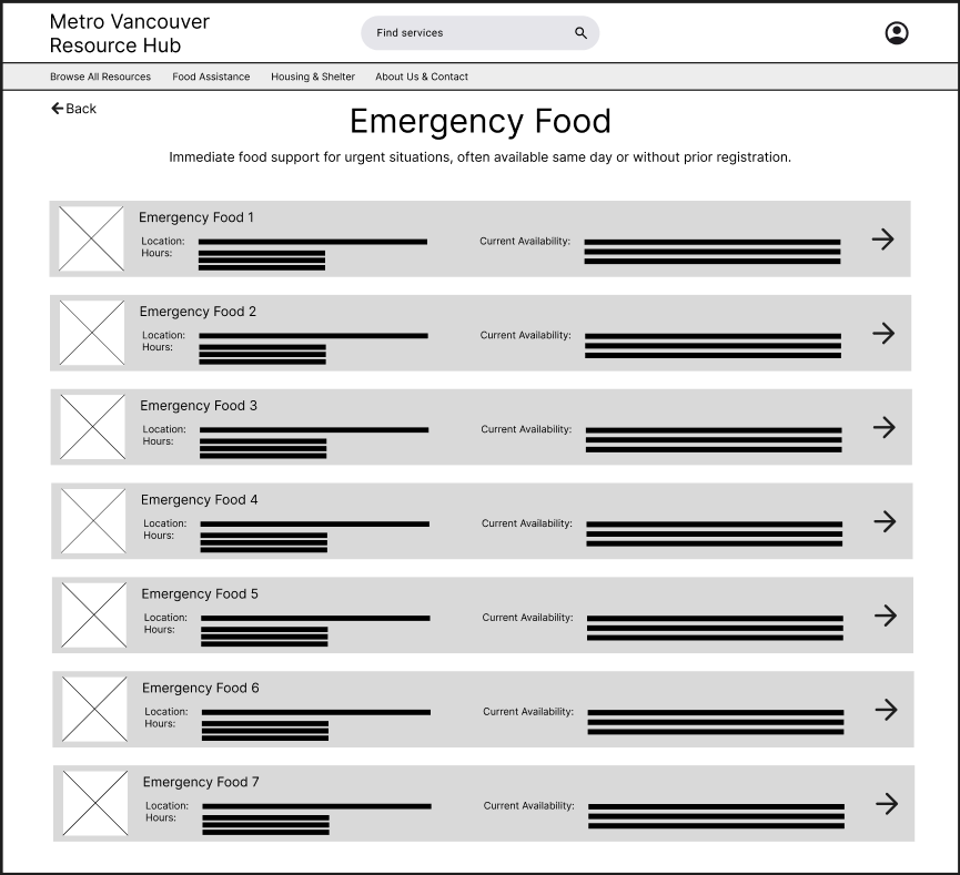
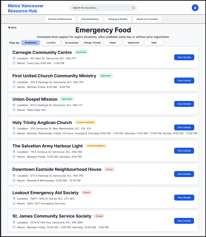
Metro Vancouver Resource Hub (Website Case Study)

The Challenge

Problem Statement

Residents across Metro Vancouver who are seeking food assistance or housing support often struggle to find clear, trustworthy, and relevant information when they need it most. Existing resources are fragmented across multiple municipal and organizational websites, each with different structures, terminology, and levels of clarity.

Some users arrive with urgent needs and require immediate direction, while others are in a planning mindset and need time to explore options and understand eligibility. In both cases, the lack of a centralized, easy-to-navigate experience increases cognitive load, slows decision-making, and can discourage users from accessing essential services.

The design challenge was to create a responsive website that enables Metro Vancouver residents to quickly identify and navigate food and housing resources, supporting both urgent needs and exploratory planning without overwhelming users or requiring prior knowledge of the system.

Goals & Objectives

The primary goal of this project was to design a responsive website that helps Metro Vancouver residents efficiently find and evaluate food assistance and housing/shelter resources, regardless of whether they are in an urgent or exploratory mindset.

Core Objectives

  • Enable users to quickly identify relevant services based on need and location

  • Reduce cognitive overload when navigating complex or unfamiliar information

  • Clearly communicate next steps so users know how to access support

  • Support both quick, goal-directed use and deeper exploration when needed

  • Present information in a calm, trustworthy, and supportive manner

These objectives guided decisions around information hierarchy, navigation structure, and interaction design throughout the project.

Assumptions & Constraints

This project was completed as a conceptual redesign, which informed several assumptions and constraints.

Assumptions

  • Users may be experiencing stress, uncertainty, or time pressure when seeking help

  • Many users are unfamiliar with service terminology, eligibility criteria, or available options

  • Users may shift between urgent and exploratory mindsets within a single session

  • Trust and clarity are critical when presenting sensitive, high-stakes information

  • A centralized, need-based structure is more intuitive than an organization-led one

Constraints

  • The project was completed by a single UX designer

  • Scope was intentionally limited to food assistance and housing/shelter services

  • Research relied on secondary sources and UX best practices rather than direct interviews

  • Administrative, backend, and service-provider workflows were out of scope

  • Content accuracy is representative rather than exhaustive

These constraints helped keep the project focused while reflecting realistic UX design limitations.

Research, User Pain Points, Personas & Journey Maps

User Research Approach

Given the sensitive nature of the problem space and the conceptual scope of the project, research focused on identifying common usability challenges through secondary research and pattern analysis.

Research Methods

  • Reviewed existing Metro Vancouver, municipal, and non-profit resource websites to understand how services are currently organized and presented

  • Analysed food bank and shelter websites to identify recurring content patterns, eligibility requirements, and points of confusion

  • Examined UX best practices for designing experiences under cognitive and emotional load

  • Synthesized insights from publicly shared user experiences and common complaints related to accessing community resources

This approach allowed the project to ground design decisions in realistic user needs while remaining transparent about research limitations.

Key User Pain Points

Research revealed several recurring pain points experienced by users seeking food and housing support:

  1. Fragmented & Inconsistent Information

    Resources are spread across multiple websites with different navigation patterns, terminology, and levels of detail. Users must repeatedly reorient themselves, increasing cognitive effort and frustration.

  2. Difficulty Understanding Where to Start

    Many users are unsure which type of service applies to their situation or how urgent their need must be to qualify. This uncertainty creates hesitation and delays action.

  3. Overwhelming Content Presentation

    Long pages of dense text, unfamiliar language, and unstructured lists make it difficult to quickly assess whether a service is relevant, especially under stress.

  4. Unclear Eligibility & Location Relevance

    Users often struggle to determine whether services are available in their area or if they meet eligibility requirements, leading to wasted time and discouragement.

  5. Lack of Clear Next Steps

    Even when users find relevant information, it is not always clear how to proceed—whether to call, visit, apply online, or prepare documentation—creating friction at critical moments.

Proto-Persona 1: Urgent Needs Seeker

Name: Alex

Age Range: 30–50

Location: Surrey, BC

Situation: Facing food insecurity and potential housing instability

Tech Comfort: Moderate

Mindset: Stressed, time-constrained, needs clarity fast

Goals

  • Find nearby food assistance or shelter quickly

  • Understand what services are available right now

  • Get clear next steps without navigating multiple websites

Frustrations

  • Overwhelming lists of resources without guidance

  • Unclear eligibility or location relevance

  • Dense language and long explanations during moments of stress

Needs

  • Simple, need-based navigation

  • Clear indicators of urgency, availability, and location

  • Actionable next steps (call, visit, prepare documents)

Proto-Persona 2: Planning & Support Explorer

Name: Maya

Age Range: 20–35

Location: Vancouver, BC

Situation: Seeking information for herself or a family member

Tech Comfort: High

Mindset: Exploring options, planning ahead, wants to understand choices

Goals

  • Compare different food or housing support options

  • Understand eligibility and requirements in advance

  • Save or share resources for future use

Frustrations

  • Inconsistent information across sites

  • Difficulty comparing services side-by-side

  • Not knowing which option best fits her situation

Needs

  • Structured information with clear categories

  • Ability to explore without pressure

  • Trustworthy, easy-to-scan content

User Journey Map

To better understand how people navigate food and housing support during moments of uncertainty or urgency, I mapped a high-level user journey from initial need recognition through accessing a service. This journey focuses on users who may be unfamiliar with available resources and are seeking clarity, reassurance, and actionable next steps rather than deep exploration.

This journey map helped identify moments of uncertainty and stress throughout the resource-finding process, ensuring that navigation, language, and information hierarchy consistently supported clarity, reassurance, and quick decision-making.

Research Summary & Influence on Design

How Research Influenced Design Decisions

These insights shaped early design decisions by emphasizing:

  • Need-based entry points over organizational structures

  • Progressive disclosure to prevent overwhelming users

  • Clear, action-oriented next steps on service detail pages

  • Flexible navigation that allows users to adjust choices without restarting

  • A tone that balances empathy with efficiency

Why Personas & Journey Mapping Mattered

The proto-personas and user journey map helped ground design decisions in real user needs, particularly for individuals navigating food and housing resources under stress, uncertainty, or time pressure. By distinguishing between users seeking urgent support and those exploring longer-term options, the personas clarified differences in mindset, information needs, and tolerance for complexity. The journey map then visualized where confusion, hesitation, or reassurance were most likely to occur across the flow, allowing key design decisions—such as simplified entry points, clear availability indicators, and expectation-setting language—to be made intentionally. Together, these tools ensured the experience prioritized clarity, trust, and actionable next steps rather than overwhelming users with information.

The Design Process

Information Architecture & Site Structure

The information architecture was designed to prioritize need-based discovery over organizational or municipal structures. Given that users may arrive in either an urgent or exploratory mindset, the structure emphasizes clarity, progressive disclosure, and flexibility—allowing users to move forward without committing to a single rigid path.

Rather than organizing content by service provider or city, the site groups resources by type of support, with location and eligibility treated as filtering attributes rather than primary navigation.

Key principles guiding the IA:

  • Reduce cognitive load at entry

  • Support both quick access and deeper exploration

  • Avoid requiring users to understand service systems upfront

  • Allow users to revise choices without restarting

High-Level Sitemap

  • Primary navigation focuses on “Find Support” to immediately orient users by need

  • Secondary navigation supports browsing and filtering without forcing commitment

  • Persistent location context (e.g., Metro Vancouver) reassures users that results are relevant

  • Search is available throughout, but not relied on as the primary discovery method

This structure supports both personas by allowing:

  • Alex (urgent) to move quickly from need → action

  • Maya (exploratory) to browse, compare, and plan

User Flows

The following flows represent the core paths users take when seeking food or housing support. These flows informed layout decisions, navigation placement, and interaction design.

Primary Flow 1: Finding Food Assistance (Urgent or Repeat Need)

User Goal: Quickly find nearby food support and understand next steps.

Design Considerations

  • Food assistance is often time-sensitive and repeatable

  • Key details (hours, location, availability) are surfaced early

  • Clear CTAs reduce hesitation at the final step

Primary Flow 2: Finding Housing or Shelter Support (High-Stress Scenario)

User Goal: Identify appropriate shelter or housing support without navigating complex systems.

Design Considerations

  • Language and tone remain calm and supportive

  • Eligibility information is clearly structured and scannable

  • Users can move backward or adjust filters without restarting

Interaction Design Rationale

  1. Prioritizing Urgent Needs Through Clear Category Entry Points

    Decision

    The homepage presents two primary actions—Food Assistance and Housing & Shelter—as large, visually prominent entry points rather than a dense list of services.

    Rationale

    Users seeking essential resources may be under stress and unsure where to start. Asking them to first identify a high-level need reduces cognitive load and prevents early overwhelm. This approach mirrors how people mentally categorize urgent needs before considering specific services.

    User Impact

    Users can quickly orient themselves and begin the journey with confidence, reducing hesitation and abandonment at the first step.

  2. Structuring Resources by Urgency Before Detail

    Decision

    Within Food Assistance and Housing & Shelter, services are grouped into clearly labeled subcategories such as Emergency Food, Food Banks, Emergency Shelters, and Temporary Housing.

    Rationale

    Different services imply different levels of urgency, availability, and eligibility. Explicitly labeling these distinctions helps users self-select the most appropriate path without requiring prior system knowledge.

    User Impact

    Users in urgent situations reach time-sensitive resources faster, while others can explore longer-term support options without confusion or false expectations.

  3. Emphasizing Key Decision Information in Resource Lists

    Decision

    List views for emergency services surface location, hours, and eligibility requirements before users navigate to detailed pages.

    Rationale

    In urgent contexts, users need to quickly assess whether a service is even viable before investing time exploring it. Highlighting these attributes supports rapid triage and avoids unnecessary clicks.

    User Impact

    Users can eliminate unsuitable options early, saving time and reducing frustration—especially critical when resources have limited capacity.

  4. Designing Resource Detail Pages Around Action, Not Just Information

    Decision

    Resource detail pages prioritize clear CTAs such as Contact Shelter, Visit Shelter, and External Site, with “Contact” emphasized as the primary action.

    Rationale

    Accessing support often requires human confirmation (availability, eligibility, next steps). Making contact the most prominent action aligns the interface with real-world service access patterns.

    User Impact

    Users are guided toward the most reliable next step, increasing the likelihood of successfully accessing support rather than passively consuming information.

  5. Providing Reassurance Around Eligibility Uncertainty

    Decision A reassurance line (“If you’re unsure whether you qualify, contacting the shelter directly is recommended”) is placed beneath the primary CTAs.

    Rationale

    Eligibility requirements can feel intimidating and exclusionary. Explicitly encouraging contact reframes uncertainty as acceptable and solvable, reducing anxiety and self-screening out.

    User Impact

    Users are more likely to take action instead of abandoning the flow due to uncertainty or fear of rejection.

  6. Intentional Prototype Scope and Navigation Constraints

    Decision

    The prototype focuses on a single representative flow (homepage → category → emergency service list → first service detail), with back navigation available on all screens.

    Rationale

    The goal of the prototype was to validate information hierarchy, interaction patterns, and decision support—not to simulate every possible path. Limiting scope allowed deeper focus on clarity and usability of critical flows.

    User Impact

    Stakeholders and reviewers can clearly understand the intended experience without being distracted by incomplete or speculative features.

These interaction decisions directly informed the wireframes and high-fidelity screens used for prototyping and usability testing.

Wireframes, Low-Fidelity Prototypes & Iteration

Low-fidelity wireframes were created to explore layout, information hierarchy, and key interaction patterns before moving into high-fidelity design. At this stage, the focus was on validating core flows and interaction clarity rather than visual polish. Select screens were iterated based on usability feedback, while others remained unchanged after initial validation.

Home Page (no changes)

The homepage is designed to reduce initial overwhelm by presenting two clear entry points—Food Assistance and Housing & Shelter—based on the most common urgent needs. A prominent search bar supports users who already know what they’re looking for, while reassurance text emphasizes that users can change paths at any time.

Food Assistance & Housing/Shelter Types Pages (Iterated)

The category pages introduce service types using clear, plain-language labels and brief descriptions, grouped by urgency and intent. During iteration, directional arrow indicators were added to reinforce clickability and reduce ambiguity around which elements could be interacted with.

Expectation-setting language was also introduced—particularly for housing services—to prepare users for differences in eligibility and availability before deeper exploration.

Emergency Food & Shelter Shelter Catalogue Pages (Iterated)

Service list pages were iterated to surface key decision-making details directly within the list view, including location, hours, and eligibility or availability. This shift allowed users to quickly scan and assess which services were viable before navigating to full details. Arrow indicators were consistently applied here as well to maintain interaction patterns established on the category pages.

Emergency Food & Shelter Details Page (Iterated)

Service detail pages were structured around action, with clear calls to action such as contacting the service, visiting the location, or viewing the official website. Based on iteration, the primary contact action was visually emphasized, and reassurance text was added to encourage users to reach out directly when eligibility was unclear.

Supporting elements such as maps and images were included to help users feel more confident and prepared before taking action.

Usability Testing

The following usability testing insights informed the wireframe iterations described in the previous section.

Testing Goals

The usability testing focused on validating whether users could:

  • Understand where to start when seeking urgent food or housing support

  • Identify which services were relevant to their situation

  • Recognize which elements were interactive

  • Confidently take next steps after reviewing a service

The goal was to uncover friction in navigation, clarity, and action readiness before moving into high-fidelity design.

Method & Setup

  • Method: Moderated usability testing using a low-fidelity Figma prototype

  • Participants: 3 participants representing a mix of familiarity with community resources

  • Platform: Figma prototype with limited, representative flows

  • Scope: Homepage → category → emergency service list → service detail page

  • Fidelity: Low-fidelity wireframes to focus feedback on structure and interaction, not visuals

Testing was conducted using a think-aloud approach, with participants encouraged to explain their decisions and expectations as they moved through the flow.

Sample Tasks Tested

Participants were asked to complete the following tasks:

  1. “You’re looking for urgent food support in your area. Where would you start?”

  2. “Find an emergency shelter you could access today.”

  3. “From the list of services, decide which option seems most viable for you.”

  4. “After reviewing a service, what would you do next?”

Key Findings

  • Finding 1: Unclear clickability at the category and list levels

    Some participants hesitated before selecting categories or services, unsure whether entire cards were clickable.

  • Finding 2: Users wanted to decide viability earlier

    Participants expressed a desire to know basic constraints (location, hours, eligibility) before clicking into full service details.

  • Finding 3: Users expected a clear primary action on detail pages

Participants looked for a clear “next step” after reviewing service information rather than additional reading.

Design Changes Informed by Testing

Based on these findings, several wireframe-level changes were made:

  • Added directional arrow indicators on category and service list cards to reinforce clickability and reduce hesitation.

  • Surfaced key details (location, hours, eligibility/availability) directly within service list views to support faster decision-making.

  • Strengthened CTA hierarchy on service detail pages, emphasizing direct contact as the primary action.

  • Introduced reassurance messaging to encourage users to reach out even when eligibility was uncertain.

These changes improved clarity, reduced friction in early decision-making, and better aligned the interface with real-world access patterns for community services.

These wireframes were used to validate structure, hierarchy, and core interaction flows before moving into higher-fidelity design.

High-Fidelity Mockups

The high-fidelity designs focused on reinforcing clarity, trust, and accessibility without introducing unnecessary visual complexity. Visual styling was intentionally restrained to support users navigating urgent needs and to keep attention on primary actions. The overall structure remained consistent with the wireframes, with changes focused on improving affordances and content completeness.

Added CTA Buttons on the Home Page

The home page was designed to immediately orient users toward the two primary support paths—Food Assistance and Housing & Shelter—without introducing unnecessary complexity. The addition of the phrase “when you need it” reinforces the site’s role as a timely, supportive resource, offering reassurance to users who may be navigating urgent or stressful situations. Primary actions are presented as large, high-contrast cards to make the next step clear and accessible.

Food Assistance & Housing/Shelter Category Pages

The category pages for Food Assistance and Housing & Shelter were designed to help users make an initial, high-level decision with minimal effort. Each page groups services into three clearly defined categories based on urgency and type of support, reflecting how users naturally think about their needs in stressful situations. A line of support and encouragement was also added at the bottom of each page to reassure users they have help available.

Concise descriptions and consistent visual structure support fast scanning, while explicit navigation cues signal that each category can be explored further. Distracting secondary content and advanced filtering were intentionally deferred to later steps, allowing users to focus on identifying the right type of service before reviewing individual providers. This approach balances speed, clarity, and emotional ease during early decision-making.

Refining Service Discovery Through Status Visibility & Action Clarity

The emergency food and emergency shelter service lists were refined in high-fidelity to better support quick scanning and decision-making in time-sensitive contexts. Clear availability indicators (Open Now, Limited Availability, Closed) were introduced to immediately communicate service status at a glance, reducing uncertainty and unnecessary clicks.

A lightweight filtering system was added to allow users to prioritize services by availability, location, accessibility, or eligibility depending on age or gender (supporting both urgent needs and planned exploration). Within each availability group, services are alphabetically ordered to improve predictability and ease of scanning.

Dedicated “View Details” call-to-action buttons were added to each service card to make the next step explicit and consistent across the list. This helped separate browsing from commitment, allowing users to quickly compare options before choosing to view more detailed information.

Emergency Food Service Detail Page

The emergency food service detail page is designed to help users quickly determine whether a service meets their immediate needs. Critical information such as location, hours, and real-time availability is surfaced at the top to support fast scanning and reduce uncertainty.

Photos and an embedded map provide visual and spatial context, helping users recognize the location and plan their visit with confidence. Primary actions—Contact Service, Visit Location, and External Site—are prominently placed to clearly guide next steps, while secondary actions like saving to favourites remain accessible without distraction.

A detailed service description allows users to understand what is offered and what to expect upon arrival, supporting informed decision-making. An expectation-setting message encourages contacting the service directly if availability is unclear, reinforcing trust and reducing hesitation in urgent situations.

Emergency Shelter Service Detail Page

The emergency shelter detail page prioritizes clarity and urgency, surfacing essential information—location, hours, eligibility, and current availability—at the top to help users quickly assess whether the shelter is a viable option. Eligibility requirements are explicitly listed to reduce uncertainty and prevent wasted trips.

Visual elements, including photos and an embedded map, help users recognize the shelter and plan their arrival. Primary actions such as Contact Service, Visit Location, and a link to the external site are emphasized to support immediate next steps, while secondary actions like saving to favourites remain available.

A clear expectation-setting message encourages users to contact the shelter directly if eligibility or availability is unclear, reinforcing trust in high-stress situations. Detailed service information below provides context on what support is offered, helping users feel prepared and informed before arrival.

The high-fidelity mockups were connected into a clickable prototype to validate final interaction patterns.

Reflections & Learnings

This project resulted in a clear, low-friction experience that helps users quickly identify and access food and housing support in Metro Vancouver. By prioritizing urgency, availability, and clear next steps, the design reduces decision fatigue and helps users move from uncertainty to action with confidence. The final flow supports fast scanning at the catalogue level while still offering detailed information when needed.

User Insights

  • Users seeking essential services are often under stress and prioritize immediate availability over comprehensive exploration.

  • Unclear eligibility requirements can prevent users from taking action, even when services are accessible.

  • Simple reassurance and expectation-setting language helps users feel supported rather than overwhelmed.

  • Users benefit from seeing key details (location, hours, eligibility, availability) upfront before committing to deeper exploration.

Design Learnings

  • Designing for urgency requires a different hierarchy than traditional browsing experiences, with emphasis on clarity and action.

  • Progressive disclosure is especially effective for support services, allowing users to access essential information first and details later.

  • Explicit visual cues (status indicators, arrows, CTAs) reduce hesitation and make navigation feel more intuitive.

  • Small interaction decisions—such as clear “View Details” actions and consistent card layouts—can significantly improve user confidence and flow.

Next Steps & Opportunities for Improvement

If this project were extended further, I would focus on validating and expanding the experience to better support a wider range of user needs and real-world scenarios.

Additional User Testing

Future rounds of usability testing would involve individuals with lived experience accessing food and housing services, as well as frontline support workers. This would help validate assumptions around urgency, eligibility clarity, and language tone, and ensure the design is inclusive and accessible.

Expanded Filtering & Personalization

While availability and location are high-priority filters, future iterations could include filters such as family-friendly options, accessibility needs, or dietary restrictions. These filters would help users quickly identify services that are relevant to their circumstances without overwhelming them.

Real-Time Data & Service Updates

Integrating real-time availability updates and service alerts (e.g., capacity changes or temporary closures) would further reduce uncertainty and prevent unnecessary trips. Partnerships with service providers could help keep information accurate and timely.

Accessibility & Language Support

Future improvements would include multilingual support, plain-language content audits, and enhanced accessibility features such as screen-reader optimization and high-contrast modes, ensuring the platform supports users with diverse abilities and language needs.

Broader Platform Expansion

Longer-term opportunities include expanding beyond food and housing into related support areas such as mental health services, income assistance, or employment support—while maintaining the same clarity and urgency-first design principles.

This project reflects my interest in designing thoughtful, human-centred experiences that make essential support easier to understand and access.

Questions about this project? Feel free to contact me :)

Previous
Previous

GearUp