Project Overview
This project explores the design of a mobile app that helps gamers browse and compare gaming accessories across platforms. While the broader app concept supports multiple accessory categories (keyboards, headsets, etc.), this project focuses in depth on console controllers to explore product discovery, detail exploration, and side-by-side comparison flows.
The primary goal was to reduce decision fatigue by providing clear product information, meaningful comparisons, and intuitive interaction patterns for evaluating similar products. I worked as the sole UX designer, responsible for research, ideation, wireframing, prototyping in Figma, and usability testing. The project was completed over approximately 5 weeks as part of the Google UX Design Professional Certificate.
Role: UX Designer (Solo Project)
Platform: Mobile (iOS & Android – conceptual)
Timeline: 5 weeks
Scope: The project focused on validating the core browsing and comparison flows for gaming controllers. Secondary actions and edge cases were intentionally deprioritized to manage scope and allow deeper exploration of primary user paths.
GearUp (App Case Study)
The Challenge
Problem Statement
Gamers shopping for gaming accessories often struggle to compare similar products due to fragmented information, inconsistent specifications, and unclear differences between options. Existing retail and review experiences tend to prioritize product listings over meaningful comparison, forcing users to mentally track details across multiple pages. This increases cognitive load and makes it harder for users to confidently evaluate and choose between comparable accessories.
Goals & Objectives
Enable gamers to browse different types of gaming accessories by category or platform
Support quick, side-by-side comparison of key product attributes
Reduce cognitive load during product evaluation and decision-making
Design and validate intuitive interaction flows for browsing and comparison
Assumptions & Constraints
This project was completed as a solo, time-boxed effort over approximately five weeks. The design assumes a consumer-facing mobile app intended for gamers who are familiar with purchasing gaming accessories online.
To keep the scope manageable, the project focuses on validating core browsing, product detail, and comparison flows. While the broader app concept supports multiple categories of gaming accessories, console controllers were selected as the primary use case for exploring these interactions in depth.
The prototype prioritizes demonstrating key interaction patterns rather than full feature coverage. Secondary actions, edge cases, and some navigation paths were intentionally left non-interactive, as the goal was to evaluate primary user flows and information hierarchy rather than create a production-ready experience.
Research, User Pain Points, Personas & Journey Maps
User Research Approach
To understand common challenges faced by gamers when purchasing gaming accessories, I conducted lightweight secondary research by reviewing existing e-commerce platforms, product comparison experiences, and community discussions related to gaming hardware. This was supplemented with assumption-based insights informed by common online purchasing behaviours and personal observation as a gamer.
The goal of this research was not to validate a final solution, but to identify recurring pain points and areas of friction that could be explored through interaction design. These insights were used to guide early design decisions, inform proto-personas, and shape the primary browsing and comparison flows.
Key User Pain Points
Based on the research and problem exploration, several recurring user pain points emerged:
Overwhelming Number of Options
Users are often presented with a large volume of gaming accessory options, making it difficult to quickly narrow down products that align with their preferences, play style, or budget. This abundance of choice can lead to decision fatigue and prolonged browsing.
Difficulty Comparing Similar Products
Many existing experiences do not support direct, side-by-side product comparison. As a result, users are forced to open multiple tabs or rely on external sources to track differences between similar accessories, increasing cognitive load and frustration.
Unclear or Overly Technical Terminology
Casual or less technical gamers may encounter unfamiliar terms and specifications when evaluating products. Without clear explanations or prioritization of meaningful attributes, users may struggle to understand differences and feel confident in their decisions.
Low Trust in Reviews and Product Information
Users may question the credibility of product reviews due to concerns about sponsored content, inconsistent quality, or outdated information. This lack of trust can make it harder for users to rely on reviews as part of their decision-making process.
Proto-Persona 1: Casual Gamer
Name: Alex
Age: 29
Profile: Casual / Social Gamer
Platforms: Console (PS5 / Xbox)
Experience Level: Low–Medium
Goals
Buy reliable gaming accessories without spending excessive time researching
Understand key differences between products in simple terms
Feel confident that they are making a “good enough” choice
Frustrations
Overwhelmed by the number of available options
Confused by technical specifications and jargon
Unsure which features actually matter for their needs
Behaviours & Needs
Skims product pages rather than reading deeply
Relies on summaries, ratings, and visual cues
Benefits from clear explanations and simplified comparisons
Key UX Needs
Reduced cognitive load
Plain-language descriptions of key attributes
Clear guidance toward suitable options
Proto-Persona 2: Enthusiast Gamer
Name: Jordan
Age: 23
Profile: Competitive / Enthusiast Gamer
Platforms: Console (Primary), PC (Secondary)
Experience Level: High
Goals
Compare multiple accessories in detail before purchasing
Evaluate trade-offs between similar products
Make an informed, optimized decision based on specs and performance
Frustrations
Difficulty comparing products side by side
Inconsistent or incomplete specification information
Having to switch between multiple tabs or sites to gather details
Behaviours & Needs
Actively compares features, prices, and ratings
Comfortable with technical terminology
Wants efficient access to detailed product information
Key UX Needs
Robust comparison tools
Structured presentation of specs
Ability to evaluate differences quickly without context switching
User Journey Map
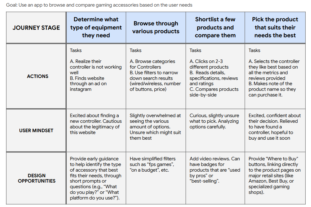
To better understand the end-to-end experience of browsing and comparing gaming accessories, I created a simplified user journey map based on the identified pain points and proto-personas. The journey highlights key stages where users experience uncertainty, cognitive overload, and decision friction, helping identify where design interventions could have the greatest impact.
The journey map helped identify that the greatest friction occurred during the evaluation and comparison stages, where users felt overwhelmed and uncertain. This directly informed the decision to prioritize side-by-side comparison as a core interaction flow, as well as the emphasis on clear filtering, structured information hierarchy, and confidence-building elements such as reviews and ratings.
Research Summary & Influence on Design
How Research Influenced Design Decisions
The identified pain points and user archetypes directly shaped the design focus of the app. To address decision fatigue, the browsing experience prioritizes clear categorization and visual hierarchy. To support both casual and enthusiast gamers, the product detail pages balance high-level summaries with access to more detailed attributes.
Most importantly, the lack of effective comparison tools across existing platforms informed the decision to prioritize side-by-side comparison as a primary interaction flow. Console controllers were selected as the initial use case to validate this comparison-driven experience before scaling to additional accessory categories.
Why Personas & Journey Mapping Mattered
The proto-personas helped anchor design decisions around two distinct user needs: users seeking clarity and reassurance, and users seeking detailed evaluation and comparison. They were used to guide information hierarchy, determine which attributes should be surfaced early versus progressively disclosed, and shape how comparison functionality was presented to support both lightweight and in-depth decision making.
The user journey map was used to visualize how user needs and emotions shifted across the purchase process, from initial problem recognition through browsing, evaluation, and final selection. It highlighted that uncertainty and cognitive overload peaked during the browsing and comparison stages, while trust and confidence were most critical early and late in the journey. These insights directly informed the decision to prioritize clear categorization, simplified filtering, and side-by-side comparison as core interaction flows, ensuring the experience addressed the most impactful moments of friction.
The Design Process
User Flows
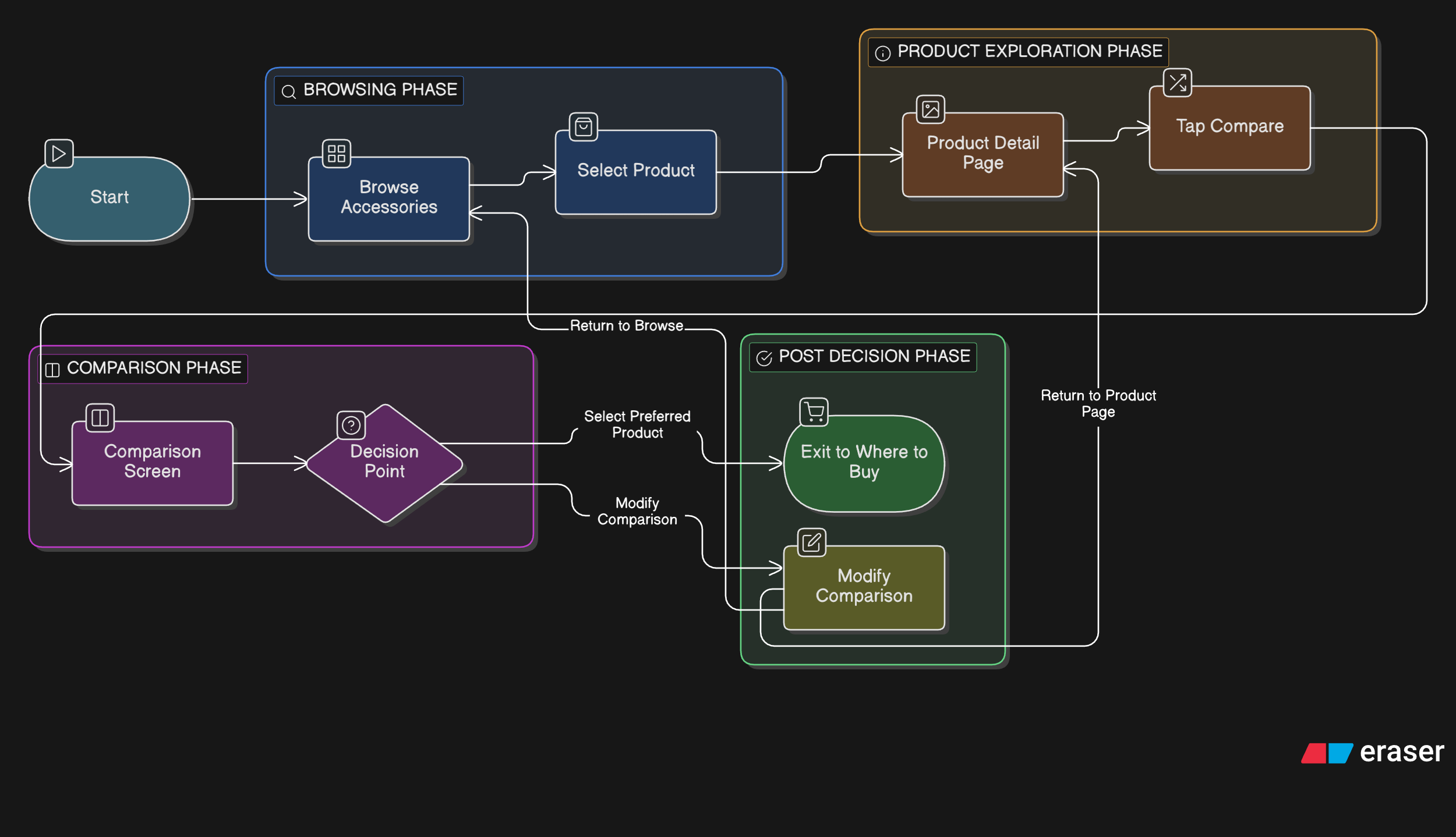
Based on the research insights and journey mapping, I focused on designing interaction flows that support product discovery, evaluation, and confident decision-making. The following user flows highlight the core paths users take when browsing gaming accessories and comparing products, with particular emphasis on reducing cognitive load during evaluation and comparison. These flows informed the structure of the information architecture and the design of key screens in the prototype.
Primary Flow: Browse → Product → Compare
This flow represents the most common path users take when evaluating gaming accessories and deciding between similar products.
Secondary Flow: Iterative Comparison
This flow supports users who refine their choices by swapping products and re-evaluating attributes before making a final decision.
Interaction Design Rationale
Prioritizing Comparison as a Primary Action
Decision: Product comparison was designed as a primary interaction, accessible directly from the product detail page.
Rationale: Research and journey mapping revealed that users experience the highest levels of uncertainty during the evaluation stage, particularly when choosing between similar products. Existing platforms often require users to manually compare specifications across multiple tabs, increasing cognitive load and friction.
User Impact: By surfacing comparison as a first-class action, users can quickly evaluate key differences side by side without losing context, supporting both casual users seeking clarity and enthusiast users seeking efficiency.
Structuring Product Information for Progressive Disclosure
Decision: Product detail pages were structured to present high-level summaries first, with more detailed attributes available as users explore further.
Rationale: The proto-personas highlighted differing comfort levels with technical information. Casual gamers benefit from simplified summaries, while enthusiast gamers want access to detailed specifications. Presenting all information at once would overwhelm some users and slow others.
User Impact: Progressive disclosure allows users to control the depth of information they engage with, reducing cognitive overload while still supporting informed decision-making.
Designing for Iterative Comparison, Not One-Time Decisions
Decision: The comparison flow was designed to support replacing and re-evaluating products rather than assuming a single, linear decision path.
Rationale: The journey map showed that comparison is often iterative, with users refining choices as they learn more. Locking users into a fixed comparison would not reflect real-world behaviour.
User Impact: Supporting iteration enables users to explore alternatives without restarting the flow, increasing confidence and reducing frustration during evaluation.
Using Controllers as a Representative Use Case
Decision: Console controllers were used as the primary, fully detailed example within the prototype.
Rationale: Due to time and scope constraints, fully designing every accessory category was not feasible. Controllers were selected because they are widely understood, spec-rich, and well-suited for demonstrating comparison behaviour.
User Impact: Focusing on a representative category allowed the core interaction patterns—browsing, evaluation, and comparison—to be validated without overextending scope.
Intentional Prototype Limitations
Decision: Only key flows and screens were fully clickable, while secondary paths were left static.
Rationale: The goal of the prototype was to validate the primary evaluation and comparison flows rather than simulate a production-ready app. Additional clickability would have increased complexity without providing proportional insight.
User Impact: This approach kept usability testing focused on the most critical interactions, ensuring feedback was actionable and relevant to the project goals.
These interaction decisions directly informed the wireframes and high-fidelity screens used for prototyping and usability testing.
Wireframes, Low-Fidelity Prototypes & Iteration
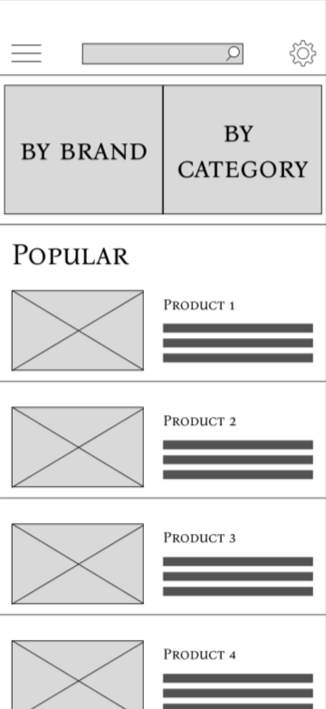
Low-fidelity wireframes were created to explore layout, information hierarchy, and key interaction patterns before moving into high-fidelity design. At this stage, the focus was on validating core flows and interaction clarity rather than visual polish. Select screens were iterated based on usability feedback, while others remained unchanged after initial validation.
Home Page (no changes)
The home screen was designed to support quick entry into browsing by surfacing popular products, categories, and search as primary actions. Early feedback indicated that users understood how to begin exploring accessories without additional guidance, so the layout remained unchanged through later iterations.
Product Description Page (iterated)
The product detail page was designed to balance high-level product information with access to deeper specifications and reviews. In the initial wireframes, the comparison action was represented using a scale icon to suggest evaluating products.
During usability testing, users did not immediately recognize the icon as a comparison action and hesitated when asked to compare products. Based on this feedback, the interaction was revised to include a clearly labelled “Compare” button, improving discoverability and reducing ambiguity.
Before iteration
After iteration
Comparison - Single Product (no changes)
The single-product comparison state represents a transitional step that allows users to begin a comparison without requiring an immediate second selection. This state tested clearly with users and supported a gradual, low-pressure entry into the comparison flow, so it did not require iteration at the wireframe stage.
Comparison - Two Products (iterated)
The two-product comparison screen was designed to allow users to evaluate key attributes side by side. In early wireframes, the comparison assumed a fixed set of products once added. During usability testing, users attempted to adjust their comparison but were unsure how to remove a product without restarting the flow.
To support more realistic, iterative decision-making, a clear removal control (“X”) was added above each product. This change allowed users to refine comparisons fluidly and aligned better with real-world evaluation behavior.
After iteration
Before iteration
The wireframes were connected into a clickable prototype to support task-based usability testing of the primary browsing and comparison flows.
Usability Testing
The following usability testing insights informed the wireframe iterations described in the previous section.
Testing Goals
The goal of usability testing was to validate the clarity and discoverability of key interactions within the low-fidelity prototype, with a particular focus on product evaluation and comparison flows. Testing aimed to identify points of hesitation or confusion rather than assess visual design or performance metrics.
Method & Setup
Lightweight usability testing was conducted using a low-fidelity Figma prototype. Participants were asked to complete a small set of task-based scenarios while thinking aloud. Sessions were informal and exploratory, with observations recorded qualitatively to identify interaction issues and opportunities for improvement.
Sample Tasks Tested
Participants were asked to complete the following tasks:
Browse gaming accessories and select a product
View product details and attempt to compare it with another product
Adjust the comparison by removing or replacing a product
Key Findings
Finding 1: Compare Action Was Not Immediately Discoverable
When viewing the product detail page, participants hesitated when asked to compare products and did not immediately associate the scale icon with a comparison action.
Finding 2: Users Expected to Modify Comparisons Easily
On the comparison screen, participants attempted to adjust the selected products but were unsure how to remove an item without restarting the flow.
Design Changes Informed by Testing
Insights from usability testing directly informed wireframe iterations.
Comparison action was updated from an icon-only representation to a clearly labelled “Compare” button to improve discoverability.
Removal controls were added to the comparison screen (the “X”) to support iterative decision-making without disrupting the flow.
These findings informed the next iteration of the wireframes and the development of high-fidelity mockups and prototypes.
High-Fidelity Mockups
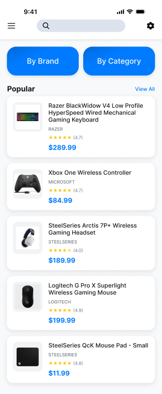
High-fidelity mockups were created to refine clarity, strengthen visual hierarchy, and add small interaction improvements that support navigation and decision-making. Visual decisions focused on readability, consistency, and reducing cognitive load rather than branding or stylistic exploration. The overall structure remained consistent with the wireframes, with changes focused on improving affordances, exit points, and content completeness.
Improving Discoverability & Navigation Entry Points
In the high-fidelity designs, additional navigation affordances were introduced to support exploration without increasing cognitive load. For example, a “View All” action was added to the Popular section to give users a clear path to deeper browsing while preserving the lightweight nature of the home screen.
Strengthening Product Evaluation & Exit Points
The product detail page was refined to better support evaluation and next-step decision-making. A “Where to Buy” section was added as a clear exit point after comparison, allowing users to transition naturally from evaluation to purchase without disrupting the primary flow. This pattern was applied consistently across product types.
Home screen mockup with “View All” added to popular section
Resulting popular products view
Product description page with new “Where to Buy” section
Reinforcing Comparison Clarity Through Visual Hierarchy
In the comparison view, visual hierarchy was refined through spacing, alignment, and typographic emphasis to make attribute differences easier to scan. These adjustments helped reduce visual noise and supported faster side-by-side evaluation without changing the underlying interaction structure.
Double product comparison view
Single product comparison view
Consistency & Readability
Consistency in spacing, typography, and component styling was maintained across all screens to support readability and reduce visual friction. Minor colour variations were used selectively to differentiate secondary areas such as settings and overlays, while preserving overall visual coherence.
Secondary screens such as menu overlays and settings were designed for completeness but are not shown here, as they did not materially impact the core browsing and comparison flows.
Final Interaction Refinements
After transitioning to high-fidelity mockups, a targeted interaction refinement was made to improve flow continuity without altering the core structure validated during usability testing.
Supporting Faster Comparison Setup
In the single-product comparison state, the add (“+”) action was refined to automatically surface products of the same type, allowing users to quickly select a second item without restarting their search. This reduced unnecessary navigation and supported more efficient comparison setup.
Filtered product list surfaced when adding a second item to comparison
The high-fidelity mockups were connected into a clickable prototype to validate final interaction patterns.
Reflections & Learnings
This project reinforced the importance of validating interaction assumptions early and refining flows based on user behavior rather than intent alone.
1. Clear Affordances Matter More Than Clever Interactions
Usability testing highlighted that visually subtle or symbolic interactions can easily be misinterpreted, even when they feel intuitive to the designer. Replacing an icon-only comparison action with a clearly labelled control significantly reduced hesitation and clarified next steps.
2. Comparison Is an Iterative, Not Linear, Task
Designing the comparison experience revealed that users rarely compare products in a single pass. Supporting quick adjustments—such as removing or adding items without restarting the flow—proved essential to reducing friction and decision fatigue.
3. Small Flow Refinements Can Have Outsized Impact
Introducing targeted interaction refinements, such as surfacing same-type products when adding to a comparison, demonstrated how small changes can meaningfully improve flow efficiency without requiring major structural redesigns.
4. Testing Early Helped Prevent Costly Rework
Conducting usability testing at the wireframe stage helped identify interaction issues before visual polish, making iteration faster and more focused. This reinforced the value of testing core flows early rather than relying on assumptions.
Next Steps & Opportunities for Improvement
If this project were continued beyond its current scope, the following areas would be prioritized to further improve usability, accessibility, and decision support.
1. Edge Cases & Error Handling
Future iterations would explore edge cases such as comparing incompatible product types, handling unavailable or out-of-stock items, and managing empty or partial comparison states. Clear system feedback and recovery paths would help prevent confusion and support smoother decision-making.
2. Accessibility Considerations
Additional accessibility work would include validating colour contrast, improving keyboard and screen reader support, and ensuring interactive elements have clear focus states and labels. Dense comparison views would be reviewed to ensure information remains perceivable and navigable for assistive technology users.
3. Expanded Comparison & Discovery Features
Future features could include more robust filtering and sorting options, saved comparisons, and personalized recommendations based on usage patterns. These enhancements would aim to reduce decision fatigue while preserving the simplicity of the core experience.
4. Metrics to Evaluate Success
If implemented in a production environment, success could be measured through metrics such as comparison completion rates, time to product selection, drop-off during evaluation flows, and frequency of comparison adjustments. Qualitative feedback from usability testing would continue to complement quantitative insights.
This project reflects my interest in designing intuitive interactions that make complex decisions feel simpler and more approachable.
Questions about this project? Feel free to contact me :)