
Wireframes & Iteration
Low-fidelity wireframes were created to explore layout, information hierarchy, and key interaction patterns before moving into high-fidelity design. At this stage, the focus was on validating core flows and interaction clarity rather than visual polish. Select screens were iterated based on usability feedback, while others remained unchanged after initial validation.
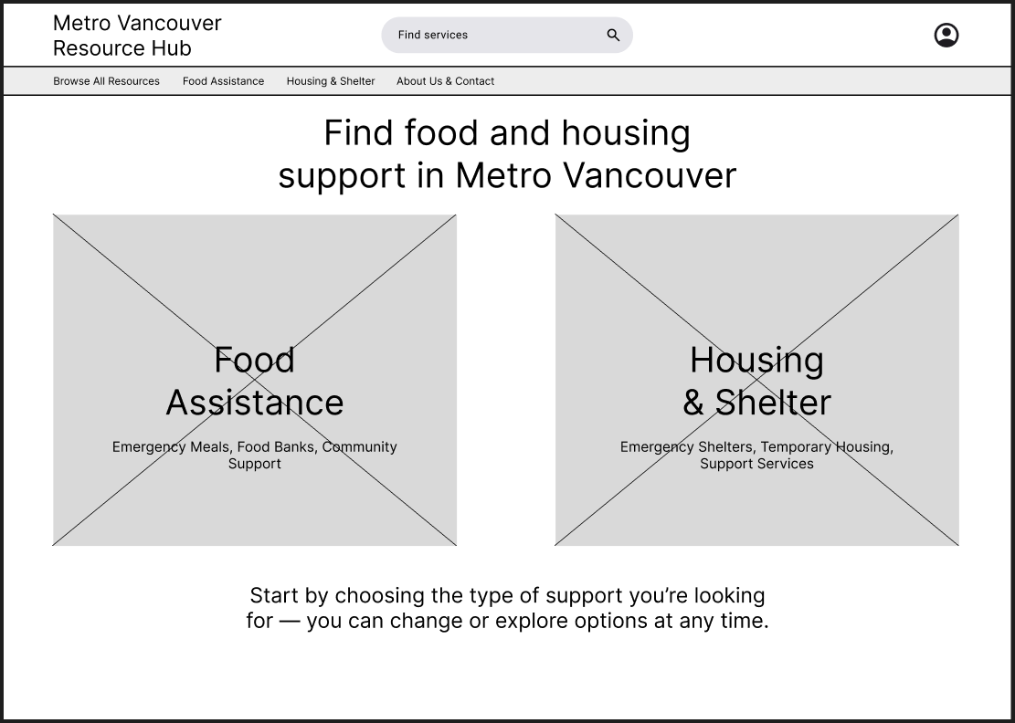
Home Page (no changes)
The homepage is designed to reduce initial overwhelm by presenting two clear entry points—Food Assistance and Housing & Shelter—based on the most common urgent needs. A prominent search bar supports users who already know what they’re looking for, while reassurance text emphasizes that users can change paths at any time.
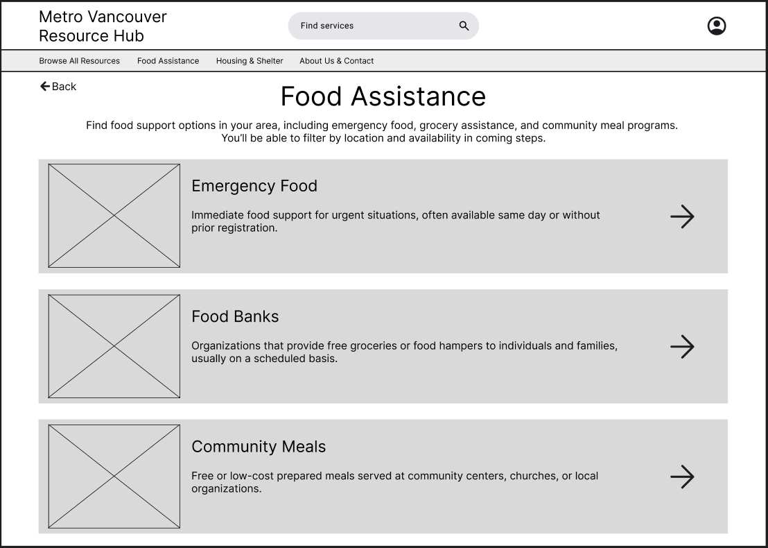
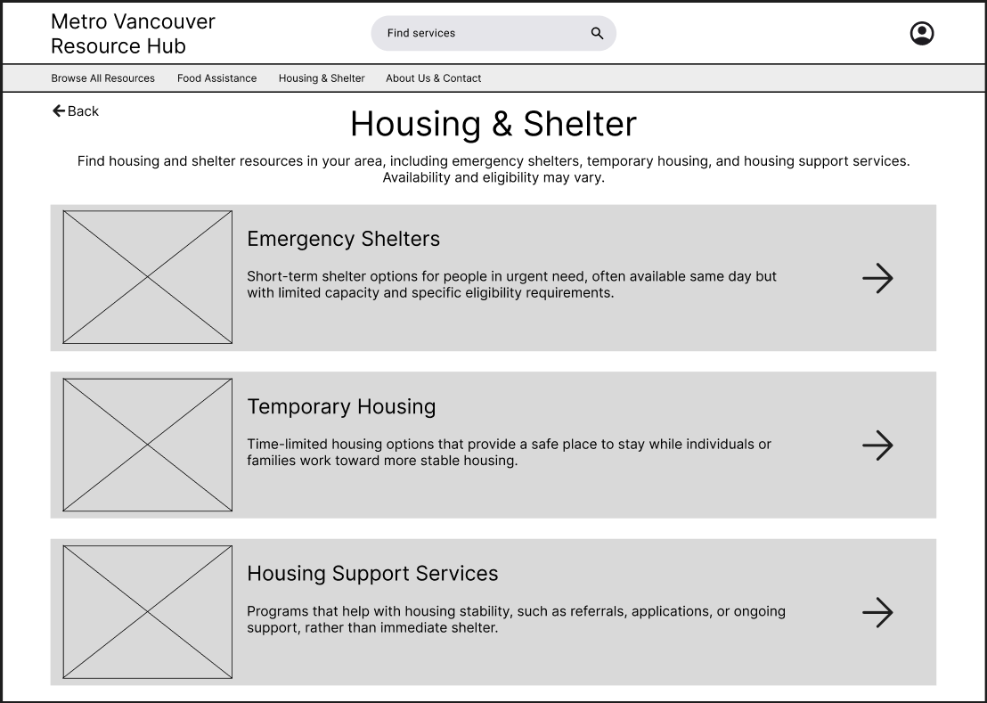
Food Assistance & Housing/Shelter Types Pages (Iterated)
The category pages introduce service types using clear, plain-language labels and brief descriptions, grouped by urgency and intent. During iteration, directional arrow indicators were added to reinforce clickability and reduce ambiguity around which elements could be interacted with.
Expectation-setting language was also introduced—particularly for housing services—to prepare users for differences in eligibility and availability before deeper exploration.
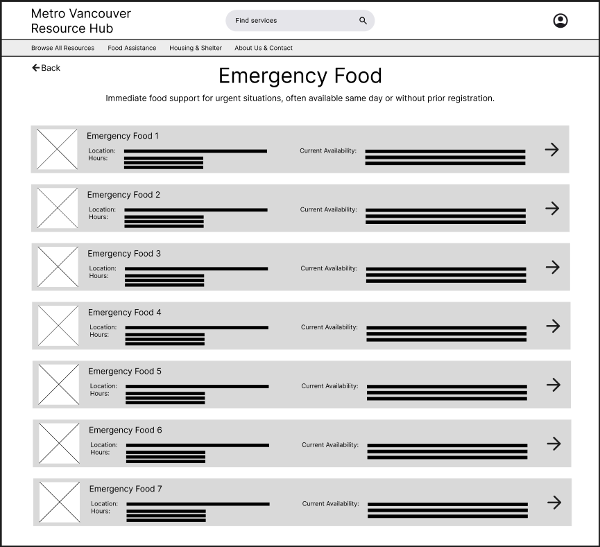
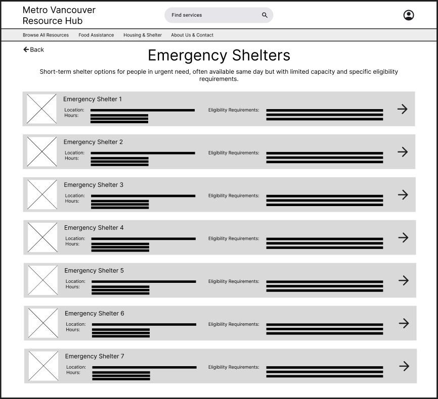
Emergency Food & Shelter Shelter Catalogue Pages (Iterated)
Service list pages were iterated to surface key decision-making details directly within the list view, including location, hours, and eligibility or availability. This shift allowed users to quickly scan and assess which services were viable before navigating to full details. Arrow indicators were consistently applied here as well to maintain interaction patterns established on the category pages.
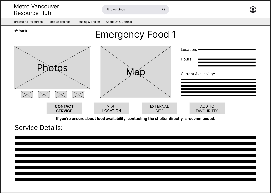
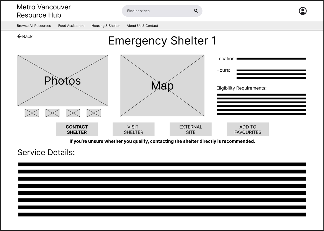
Emergency Food & Shelter Details Page (Iterated)
Service detail pages were structured around action, with clear calls to action such as contacting the service, visiting the location, or viewing the official website. Based on iteration, the primary contact action was visually emphasized, and reassurance text was added to encourage users to reach out directly when eligibility was unclear.
Supporting elements such as maps and images were included to help users feel more confident and prepared before taking action.
Usability Testing
The following usability testing insights informed the wireframe iterations described in the previous section.
Testing Goals
The usability testing focused on validating whether users could:
Understand where to start when seeking urgent food or housing support
Identify which services were relevant to their situation
Recognize which elements were interactive
Confidently take next steps after reviewing a service
The goal was to uncover friction in navigation, clarity, and action readiness before moving into high-fidelity design.
Method & Setup
Method: Moderated usability testing using a low-fidelity Figma prototype
Participants: 3 participants representing a mix of familiarity with community resources
Platform: Figma prototype with limited, representative flows
Scope: Homepage → category → emergency service list → service detail page
Fidelity: Low-fidelity wireframes to focus feedback on structure and interaction, not visuals
Testing was conducted using a think-aloud approach, with participants encouraged to explain their decisions and expectations as they moved through the flow.
Sample Tasks Tested
Participants were asked to complete the following tasks:
“You’re looking for urgent food support in your area. Where would you start?”
“Find an emergency shelter you could access today.”
“From the list of services, decide which option seems most viable for you.”
“After reviewing a service, what would you do next?”
Key Findings
Finding 1: Unclear clickability at the category and list levels
Some participants hesitated before selecting categories or services, unsure whether entire cards were clickable.
Finding 2: Users wanted to decide viability earlier
Participants expressed a desire to know basic constraints (location, hours, eligibility) before clicking into full service details.
Finding 3: Users expected a clear primary action on detail pages
Participants looked for a clear “next step” after reviewing service information rather than additional reading.
Design Changes Informed by Testing
Based on these findings, several wireframe-level changes were made:
Added directional arrow indicators on category and service list cards to reinforce clickability and reduce hesitation.
Surfaced key details (location, hours, eligibility/availability) directly within service list views to support faster decision-making.
Strengthened CTA hierarchy on service detail pages, emphasizing direct contact as the primary action.
Introduced reassurance messaging to encourage users to reach out even when eligibility was uncertain.
These changes improved clarity, reduced friction in early decision-making, and better aligned the interface with real-world access patterns for community services.
These wireframes were used to validate structure, hierarchy, and core interaction flows before moving into higher-fidelity design.
High-Fidelity Mockups
The high-fidelity designs focused on reinforcing clarity, trust, and accessibility without introducing unnecessary visual complexity. Visual styling was intentionally restrained to support users navigating urgent needs and to keep attention on primary actions. The overall structure remained consistent with the wireframes, with changes focused on improving affordances and content completeness.
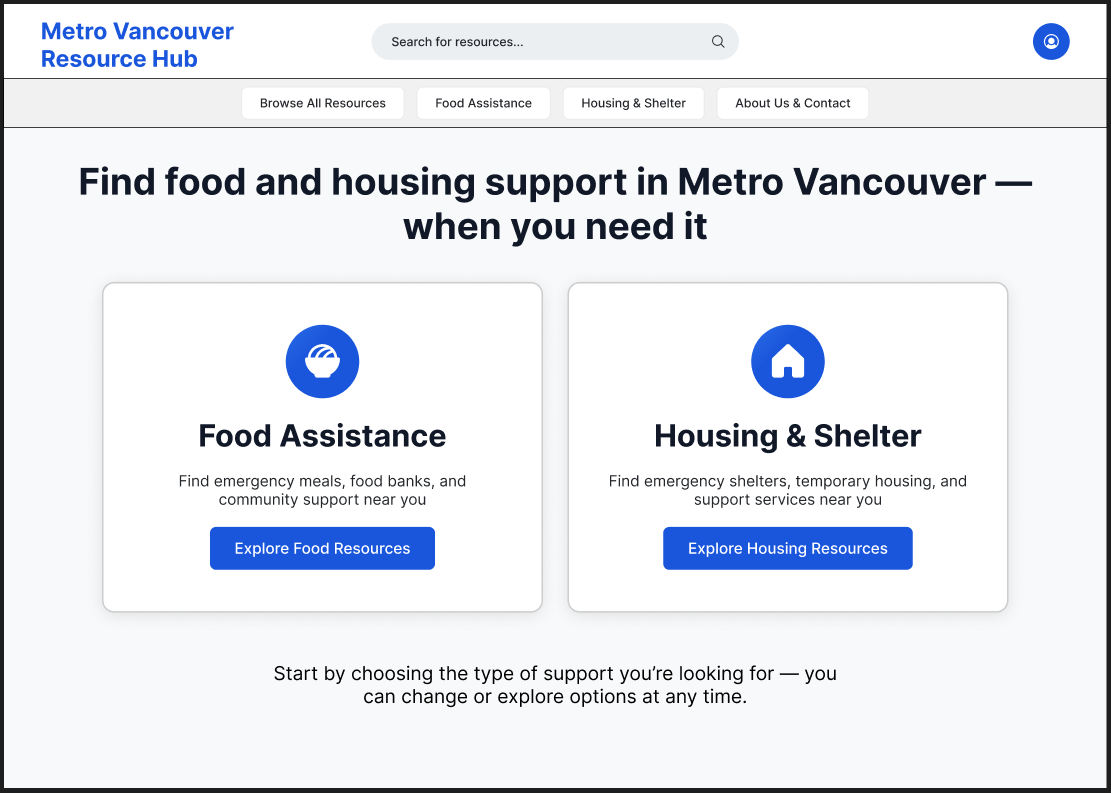
Added CTA Buttons on the Home Page
The home page was designed to immediately orient users toward the two primary support paths—Food Assistance and Housing & Shelter—without introducing unnecessary complexity. The addition of the phrase “when you need it” reinforces the site’s role as a timely, supportive resource, offering reassurance to users who may be navigating urgent or stressful situations. Primary actions are presented as large, high-contrast cards to make the next step clear and accessible.
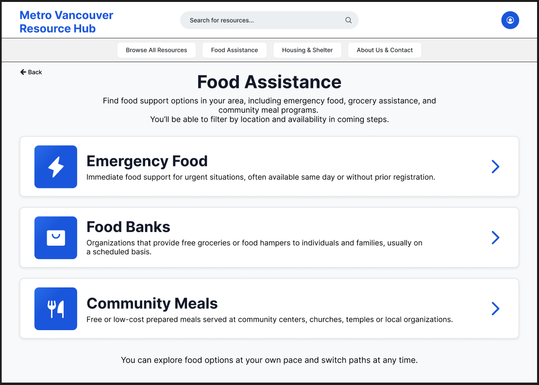
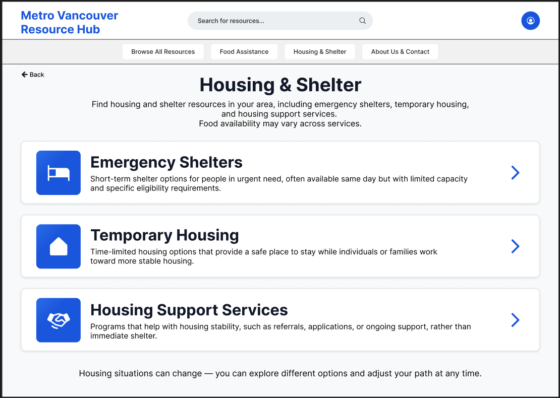
Food Assistance & Housing/Shelter Category Pages
The category pages for Food Assistance and Housing & Shelter were designed to help users make an initial, high-level decision with minimal effort. Each page groups services into three clearly defined categories based on urgency and type of support, reflecting how users naturally think about their needs in stressful situations. A line of support and encouragement was also added at the bottom of each page to reassure users they have help available.
Concise descriptions and consistent visual structure support fast scanning, while explicit navigation cues signal that each category can be explored further. Distracting secondary content and advanced filtering were intentionally deferred to later steps, allowing users to focus on identifying the right type of service before reviewing individual providers. This approach balances speed, clarity, and emotional ease during early decision-making.
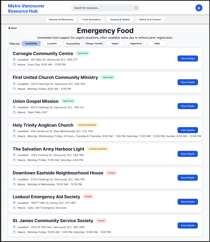
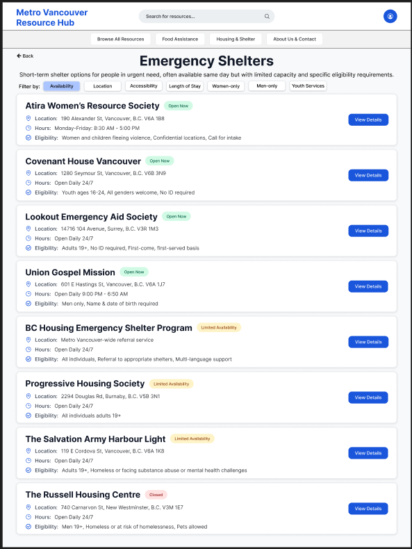
Refining Service Discovery Through Status Visibility & Action Clarity
The emergency food and emergency shelter service lists were refined in high-fidelity to better support quick scanning and decision-making in time-sensitive contexts. Clear availability indicators (Open Now, Limited Availability, Closed) were introduced to immediately communicate service status at a glance, reducing uncertainty and unnecessary clicks.
A lightweight filtering system was added to allow users to prioritize services by availability, location, accessibility, or eligibility depending on age or gender (supporting both urgent needs and planned exploration). Within each availability group, services are alphabetically ordered to improve predictability and ease of scanning.
Dedicated “View Details” call-to-action buttons were added to each service card to make the next step explicit and consistent across the list. This helped separate browsing from commitment, allowing users to quickly compare options before choosing to view more detailed information.
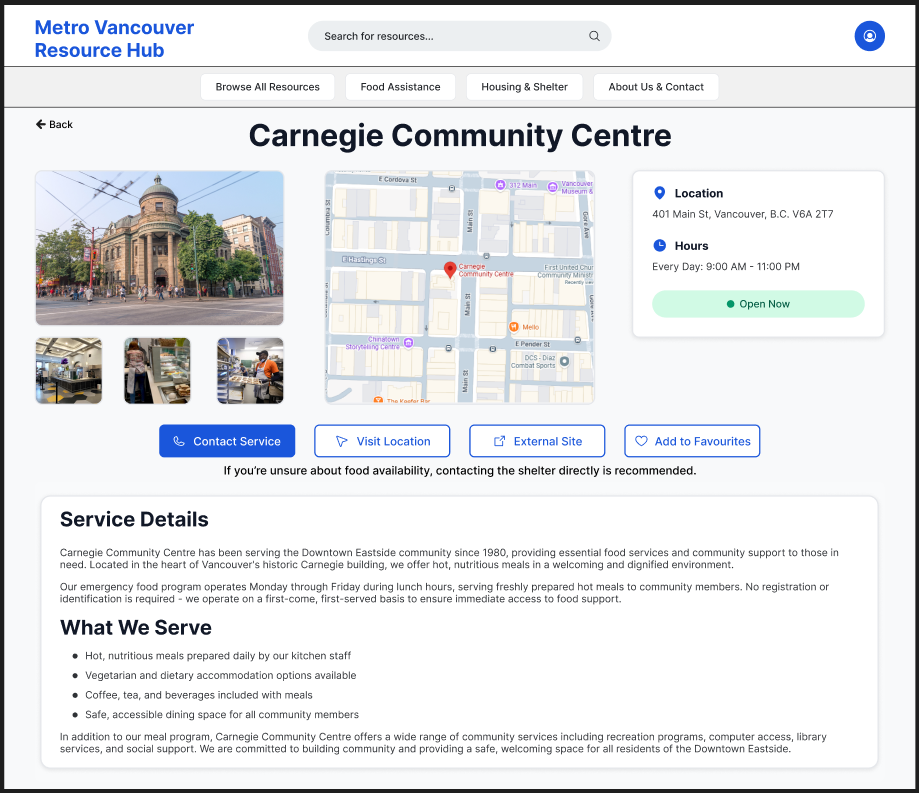
Emergency Food Service Detail Page
The emergency food service detail page is designed to help users quickly determine whether a service meets their immediate needs. Critical information such as location, hours, and real-time availability is surfaced at the top to support fast scanning and reduce uncertainty.
Photos and an embedded map provide visual and spatial context, helping users recognize the location and plan their visit with confidence. Primary actions—Contact Service, Visit Location, and External Site—are prominently placed to clearly guide next steps, while secondary actions like saving to favourites remain accessible without distraction.
A detailed service description allows users to understand what is offered and what to expect upon arrival, supporting informed decision-making. An expectation-setting message encourages contacting the service directly if availability is unclear, reinforcing trust and reducing hesitation in urgent situations.
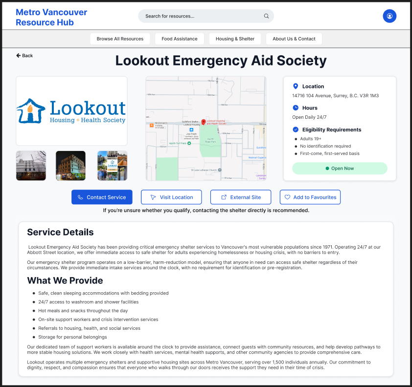
Emergency Shelter Service Detail Page
The emergency shelter detail page prioritizes clarity and urgency, surfacing essential information—location, hours, eligibility, and current availability—at the top to help users quickly assess whether the shelter is a viable option. Eligibility requirements are explicitly listed to reduce uncertainty and prevent wasted trips.
Visual elements, including photos and an embedded map, help users recognize the shelter and plan their arrival. Primary actions such as Contact Service, Visit Location, and a link to the external site are emphasized to support immediate next steps, while secondary actions like saving to favourites remain available.
A clear expectation-setting message encourages users to contact the shelter directly if eligibility or availability is unclear, reinforcing trust in high-stress situations. Detailed service information below provides context on what support is offered, helping users feel prepared and informed before arrival.
The high-fidelity mockups were connected into a clickable prototype to validate final interaction patterns.
This project reflects my interest in designing thoughtful, human-centred experiences that make essential support easier to understand and access.
Questions about this project? Feel free to contact me :)