Menu Redesign
March 2026
User Research
The frustration with Fortnite's mode selection isn't a niche complaint. It's been one of the most consistently voiced criticisms across the community for years. On Reddit, players have repeatedly called out how difficult it is to locate core game modes within the Discover screen, with the general consensus being that Epic's own modes get buried beneath a flood of Creative content. One Reddit post by concept artist "FatalityYeti", proposing a redesigned mode selection menu that placed core modes front and center, attracted significant community attention, with multiple users piling on to express their own frustrations with how hard it is to find what they're actually looking for. The reaction highlighted a shared feeling that the current menu is too complicated and busy, making what should be a simple process of selecting and queuing up for a match feel like more work than it needs to be.
The complaints go beyond Reddit. Even popular streamers have publicly criticized the menu, with xQc pointing out that the UI feels like it's trying to simplify things but ends up doing the opposite, making navigation more complicated for players who have been playing for years. The feedback reached a point where Epic Games themselves acknowledged it, with a developer stating publicly that Discovery was not meeting the needs of either players or creators.
My own experience, along with input from friends who have been playing since 2018, reflects exactly this. Finding a core mode shouldn't require any effort at all, and yet it consistently does. That shared frustration, both from the broader community and from people I've played with, is what this redesign is directly responding to.
Fortnite Lobby Redesign (Before vs After)
The lobby change was straightforward but necessary. A Mode Selection button now sits at the bottom of the screen, clearly labelled and always visible. Previously, the only way to navigate to the Discover screen from the lobby was to scroll down, a gesture with little visual indication that it even existed. For a new player, that path was essentially invisible. The button doesn't change how the Discover screen works; it just makes sure players can actually find their way there without having to stumble across it by accident.


Current Mode Selection Menu
Moving past the lobby into the mode selection menu, each tab currently presents every mode in the same grid layout, with little hierarchy separating what matters from what doesn't. The "Battle Royales By Epic" row or "Featured By Epic" row (in the "Discover" Tab) , which often houses select modes, isn't guaranteed to sit at the top of the screen, and its position can shift depending on the season and what Epic is actively promoting. On any given day, a returning player could load in and find featured Creative maps taking up more prominent real estate than Battle Royale.
There's no visual weight distinguishing the modes most players are there to play from the hundreds of community-made maps filling the rest of the grid. If you know exactly what you're looking for you'll find it eventually, but you shouldn't have to look at all. While the "By Epic" tab (shown below) is the best place to find the core modes, it is not immediately obvious that this is where one should search. Even then, it leads to unnecessary extra time being taken, which should not have to be an issue when trying to play the core modes.

Current "By Epic" Tab in the Mode Selection Menu
Design Addition #1: Four Core Modes
The first decision was to establish a fixed section at the top of the Discover screen dedicated to four core modes: Battle Royale, Reload, Fortnite OG, and Creative. Unlike the rest of the screen, this section and the search bar do not move. As players scroll through the rows and categories below, the core modes stay pinned at the top, always visible and always accessible. The search bar and genre categories sit just beneath them, keeping browsing tools close at hand without competing with the core modes for visual priority. The intent was simple: no matter what Epic is promoting that season or how the rest of the grid shifts around, the modes most players actually come to play are the first thing they see, every time.
I would like to mention that in the screenshot below (and the one in the next section), we have moved to the "Discover" tab. Just to be clear, the highlighted core mode design mentioned above remains the same throughout all five tabs in the menu. This picture is just to show what it looks like.

Initial Redesign with Four Core Modes Highlighted
Design Iteration: Reduced to Three Core Modes
Having four pinned modes started to feel like one too many. Creative has grown so large that it's less a game mode and more a platform within a platform, home to thousands of community maps, experiences, and entirely separate games. Treating it the same as Battle Royale or OG at the top of the screen gave it a prominence that didn't quite fit what it actually is. Dropping it from the pinned section and keeping the three core modes gave the layout more breathing room, and making those three tiles slightly larger reinforced their place in the hierarchy without needing anything else to signal it.

Design Iteration Reducing to Three Core Modes
Design Addition #2: Hover Interaction over Core Modes
A key UX change was adding a hover interaction on each of the three core mode tiles. Hovering over a tile surfaces a few short points summarising what the mode is, along with the options available within it, things like ranked play, builds, and zero build. It's a small but useful moment of context for a player who might be returning after time away and wants a quick refresher before committing, or a newer player who isn't yet sure what distinguishes one mode from another. The information is there when you need it, and out of the way when you don't.


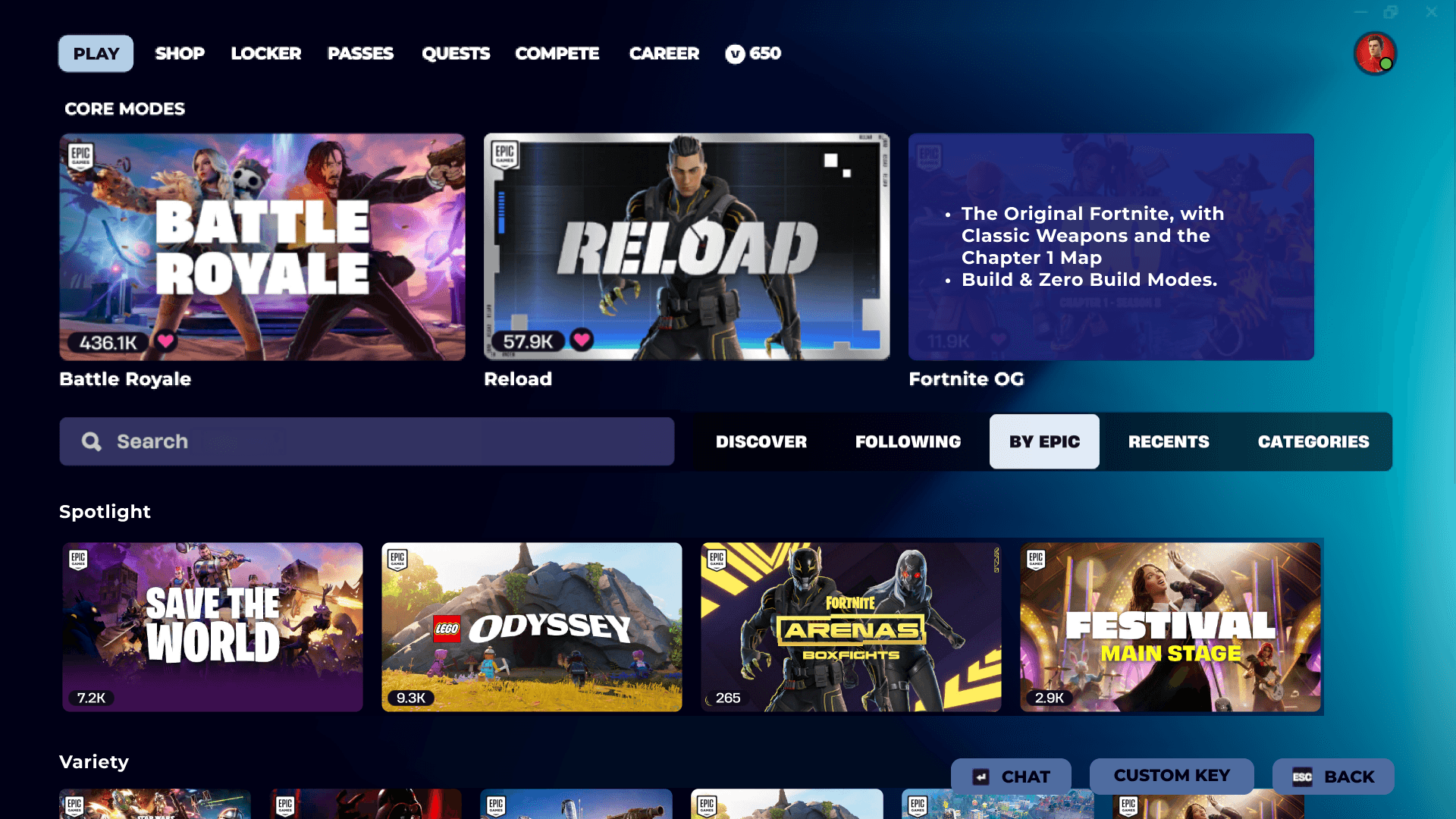
Menu Redesign (Before vs After)
The HUD redesign landed on two additions that complement each other well. The material counter sits permanently beside each teammate's health bar, always visible, always current. It's the kind of information that changes constantly during a match and is genuinely useful at any given moment, so it earns its place as a persistent element. The loadout display takes a different approach, appearing only when the player opens their inventory, then stepping back out of the way. Together they give players a meaningful upgrade in team awareness without overwhelming the screen. Everything added has a reason to be there, and nothing overstays its welcome.
I would just like to highlight once again that the three core modes and the search bar (with its five tabs) remain the constant in every single section, with the content below (that is subjective to each tab) altering depending where the user is.
