HUD Redesign
March 2026
User Research
The ideas behind the HUD changes aren't entirely new to the Fortnite community. Reddit users have previously proposed the concept of being able to see teammates' loadouts directly in the HUD, with the suggestion noting it would be particularly useful in auto-fill lobbies where teammates have no mic, allowing players to help out by seeing what weapons and items they're carrying. The thinking was that it could save time, reduce the need to constantly ask teammates what they have, and encourage better teamwork overall. Importantly, the same community discussion acknowledged that displaying full loadouts at all times would take up a lot of screen space, especially in squads, and suggested the information might be better placed somewhere like the pause menu instead. That tension between value and screen real estate fed directly into how the loadout display was handled in this redesign.
On the materials side, the Reddit community has shown clear interest in making material information more readable at a glance, with one community suggestion around improving how material quantities are visually communicated earning over 6,000 upvotes on the subreddit. The appetite for better material visibility has been there for a long time.
My own experience and input from friends who have been playing since 2018 pointed in the same direction. The material counter came from personal frustration with not having that information readily available during team play, and the loadout idea came from a friend who felt the same gap. The broader community had already been asking for something similar; this redesign is an attempt to actually put it on screen in a way that works.
Current Fortnite Gameplay HUD
Looking at the current HUD, teammate information is minimal. You have an indicator showing where they are on the map, and in the bottom left you can see each teammate's name, along with their health and shield bars. That's it. There's no material count, no indication of what weapons they're carrying, nothing beyond the basics. Compare that to the bottom right of the screen, where your own materials and full loadout are clearly laid out at all times. The gap between what you know about yourself and what you know about your team is significant, and it's what this redesign looks to close.

Current Fortnite HUD
Design Addition #1: Material Counter for Teammates
The first addition is a builds counter displayed beside each teammate's health bar in the bottom left. Showing individual icons for wood, stone, and metal was considered, but that approach takes up significantly more space and still requires you to do the math yourself in the middle of a fight. Instead, the counter converts their total materials into a single number representing how many pieces they can build.
In Fortnite, every structure costs 10 materials to place, so (for example) 300 wood allows for 30 structures, 142 stone allows for 14, and 87 metal allows for 8. Therefore, the counter would add 30 + 14 + 8 and display 52, indicating that teammate has 52 builds they can place.
One number, instantly readable, telling you exactly how much your teammate has to work with. No guessing, no mental math, no asking. In the example photo below, one teammate can currently build 119 things, and the other can build 75.
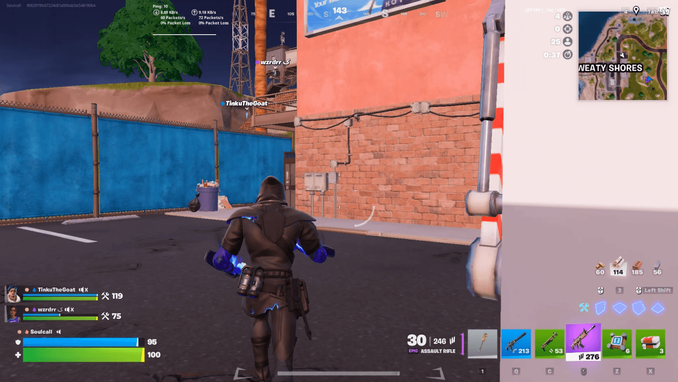
HUD with a Material Counter
Design Addition #2: Loadout Display for Teammates
The second addition was a display of each teammate's loadout below their health/shield bar, showing what weapons they're currently carrying. In practice though, having this visible at all times was deemed to be too much. It occupied a considerable amount of screen space and, compared to the material counter, the return wasn't quite worth it. Knowing a teammate has a sniper rifle is useful, but it's not information you need constantly in front of you the way material count is.
This led to an iteration: rather than scrapping the idea entirely, the loadout display was reworked to only appear when the player opens/toggles their own inventory, making it a contextual detail rather than a permanent fixture. That solution is covered in the next section.

HUD with Material Counter & Loadout
Design Iteration: Contextual Loadout Display
The fix was to tie the loadout display to a moment when it actually makes sense to look at it. When a player opens their own inventory to check or manage their gear, they're already in the mindset of thinking about equipment, what they have, what they're missing, what they might need. That's the natural moment to also know what their teammates are carrying.
So rather than showing teammate loadouts at all times, they now appear only when the player's inventory is open. Visually, the teammate's loadout icons are displayed at full opacity while their nameplate and health bar soften slightly into the background, keeping the loadout as the clear focal point without the rest of the teammate panel competing for attention.
Once the inventory is closed, everything returns to its default state and the screen goes back to being clean (only the material counter is visible, along with teammate health and shield bars). The information is available exactly when you'd want it, and invisible when you wouldn't. It's a small shift in how the feature works, but it's what took this addition from feeling like clutter to having a real purpose.

Inventory HUD Emphasizing the Player's and Teammate's Loadout
The Final HUD
The HUD redesign landed on two additions that complement each other well. The material counter sits permanently beside each teammate's health bar, always visible, always current. It's the kind of information that changes constantly during a match and is genuinely useful at any given moment, so it earns its place as a persistent element. The loadout display takes a different approach, appearing only when the player opens their inventory, then stepping back out of the way. Together they give players a meaningful upgrade in team awareness without overwhelming the screen. Everything added has a reason to be there, and nothing overstays its welcome.